


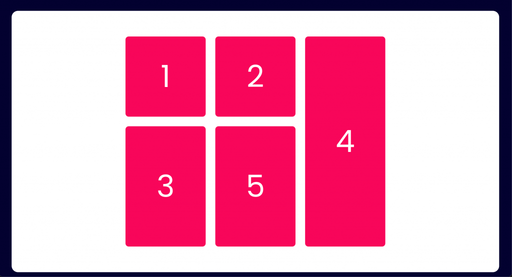
Find out the right option for making your code cleaner, more scalable, and easier to improve
CSS Flexible Box (Flexbox) and CSS Grid (Grid) are two CSS layout models that trended in recent years. Both allow creation of complex responsive web design layouts across browsers, without the need to use CSS hacks. Endless layouts can be solved with both Flexbox and Grid, but do you know which one is the right tool for you? I can tell you how to select the right option according to your project’s needs.
The main idea behind Flexbox
Flexbox provides an efficient way to align and distribute the available space between items in a container. It gives a parent element the ability to alter the order, width, and height of its direct children to better fill the available space.

					.container {
	display: flex;  /* the container becomes flexible */
	justify-content: space-between; /* align the flex items through the main axis */
	align-items: center; /* align the flex items through the cross axis */
}
All direct items inside a Flexbox container automatically become flex items. This also allows modification of the order, height, and width of each child element individually.

					.item-1 {
    align-self: flex-end; /* align the flex item through the cross axis */
}

.item-2 {
    align-self: stretch;
    flex-grow: 1; /* how much a will grow relative to the rest of the flex items (default is 0) */
    order: 2; /* order of the flex item (default is 0) */
}

.item-3 {
    order: 1;
}
Decide whether you want a row-based or a column-based layout.
					.container {
	display: flex;
	flex-direction: column; /* default is row */
	align-items: stretch;
	gap: 32px; /* gap between the rows and columns */
}
Flexbox also provides an easy way to reverse the order of items within a container.

					.container {
	display: flex;
	flex-direction: row-reverse; /* column-reverse */
	justify-content: space-between;
}
A flex layout can also wrap in multiple rows or columns and Flexbox treats each row or column as a separate entity, based on its content and the available space.

You can check more about Flexbox by visiting this Complete Flexbox Guide.
The main idea behind Grid
					.container {
	display:flex;
	flex-direction: row;
	flex-wrap: wrap; /* wrap-reverse */
	align-items: center;
}
CSS Grid lets you work along two axes (horizontally and vertically). It divides a container into rows and columns, thus allowing you to place items precisely into the cells defined.
Let’s try with an example:
					.container {
	display: grid;
	grid-template-columns: 1fr 1fr 1fr;
	grid-template-rows: 200px 300px;
	gap: 24px;
}
By adding display: grid property, the parent container becomes a grid. Next, we want to define the shape of our grid (i.e., how many columns and rows it will have).
With grid-template-columns we define the number of columns our grid will have. Each separate value will be a column in our grid. In our example, we will have 3 columns of the same size. The fr unit is a flexible unit that fills available space.
grid-template-rows works the same way, but for our grid rows. In this case, we will have 2 different rows of 200 and 300px;
As we already know, the gap property specifies the space between rows and columns. You can also set column-gap and row-gap if you want different sizes of gutters for each axis.
Here’s what this looks like:
Now it’s time to place our items in the exact cells we want. This is when the magic starts.
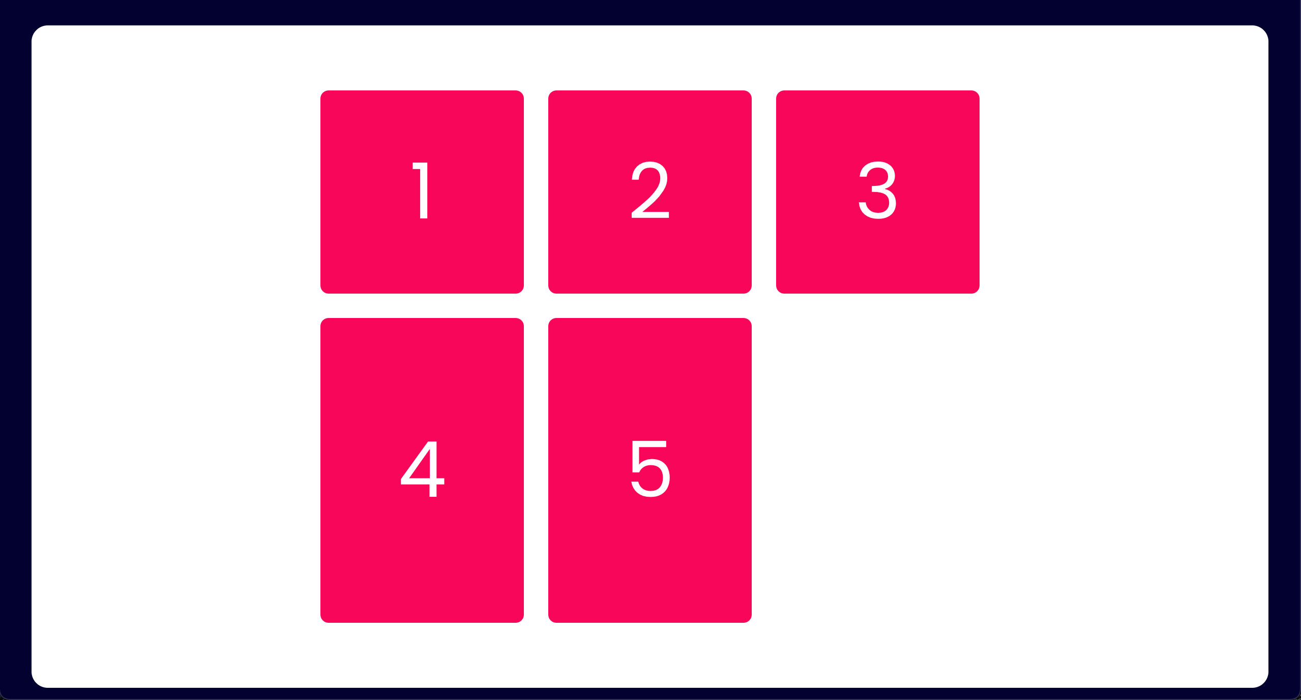
It is important to clarify that by default, each child element will be located into the first available cell, according to the order in which the cells are defined in our HTML code. So, for our example, if we have 5 elements inside our container, this is how our grid will look by default.
However, we want to override this default behavior. We want to place the fourth child element in the third column and cover both rows.
					.item-4 {
	grid-column: 3 / 4;
	grid-row: 1 / 3;
}
You must be wondering: we define a 3 columns grid, so why are we using a 4 reference in grid-column: 3 / 4?
If we look at the next image, we can see that the 3 columns of our grid form 4 vertical lines:
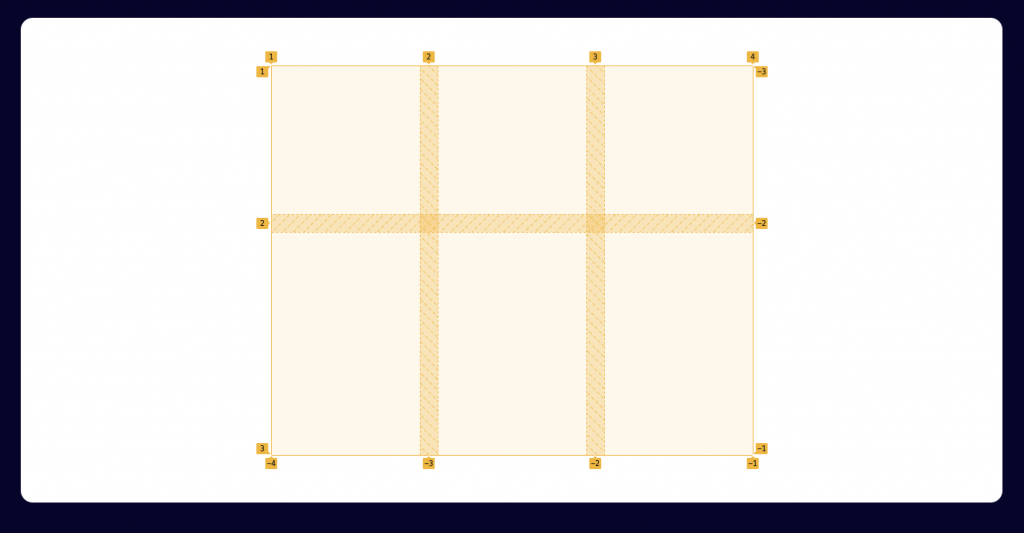
Grid columns are indexed by lines, not by cells, and the first line is referenced with 1.
By placing the child element in the third column, we must reference that column according to the vertical lines 3 and 4.
It works the same way for grid-row: 1 / 3. We are telling the child element to span the rows between horizontal lines 1 and 3.
Here’s what this looks like:
As you can see, when placing an element in the grid, the rest of the elements are reordered automatically, using the first available slot.
The possibilities are endless when reordering and locating elements within a grid. If you want to learn more about CSS Grid, I highly recommend that you read this Complete Grid Guide.
Content placement vs. content flow
There is a misconception that Grid is for full page layouts and Flexbox for smaller components. We can create two-dimensional layouts with Flexbox (due to its wrapping ability) and one-dimensional layouts with CSS Grid (due to its auto-placement ability), too. Although Flexbox is originally not for building grids, it’s frequently used that way.
Grid allows precise arrangement of elements within the grid. On the other hand, Flexbox is more focused on the content flow or, in other words, on how the elements are placed across one dimensional containers. The flex items can grow or shrink to distribute themselves and occupy all the available space within the parent container.
So...which one should you use?
Let’s think about it with this case study!
Suppose we have to layout in HTML the design of a new website and we are working with a mobile-first approach.
“Mobile first”, as the name suggests, means that we start the product design from the mobile view, then expand its features to create a tablet and desktop version.
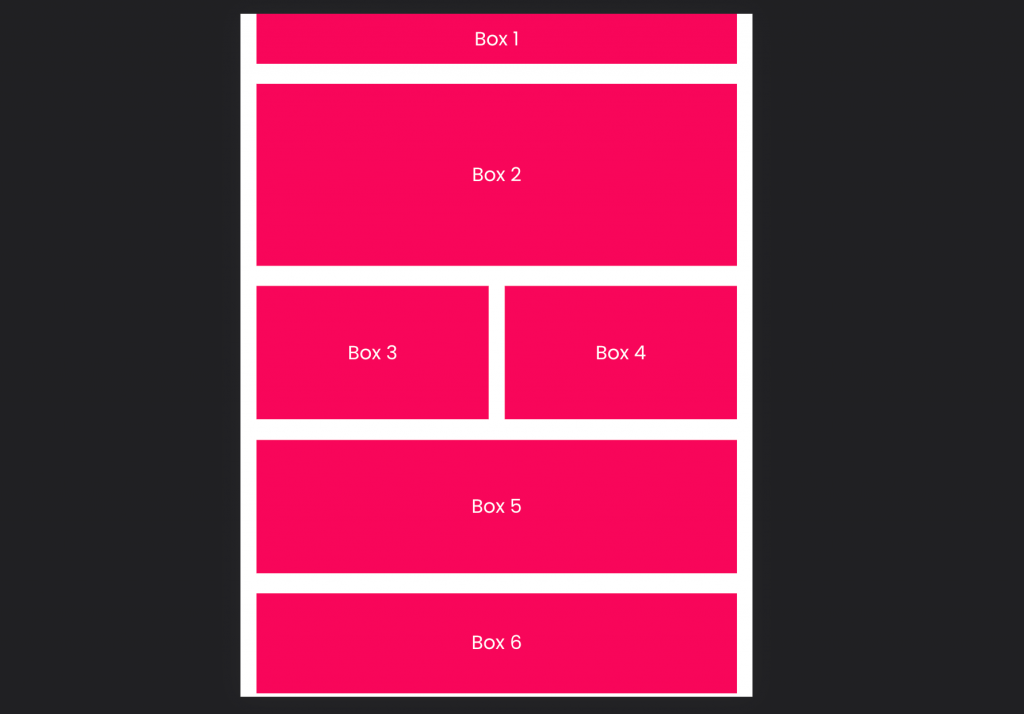
Here is the mobile version of the layout:
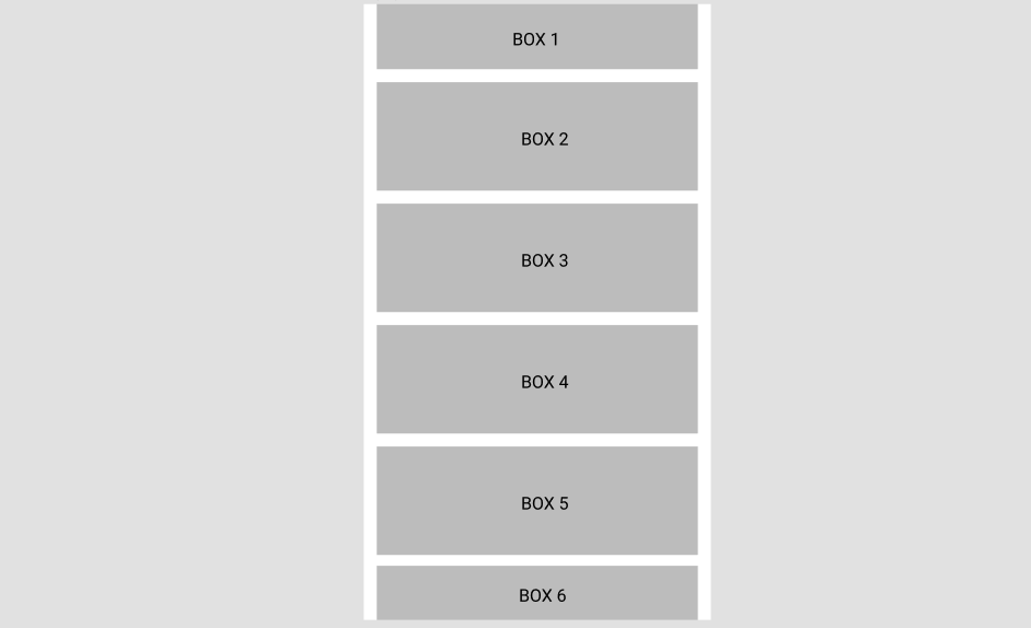
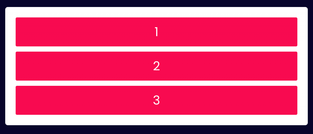
We have a column with 6 boxes along it. At first glance, we could assume that using Flexbox would be the correct approach.
Here is our HTML and CSS code:
					<div class="container">
  <div class="item one">Box 1</div>
	<div class="item two">Box 2</div>
	<div class="item three">Box 3</div>
	<div class="item four">Box 4</div>
	<div class="item five">Box 5</div>
	<div class="item six">Box 6</div>
</div>
					.container {
    display: flex;
    flex-direction: column;
    gap: 1.5rem;
}

.item {
    background-color: #F9065A;
    color: white;

    /* Place the text in the center of the item */
		display: flex;
	  justify-content: center;
		align-items: center;
}

.one {
    height: 60px;
}

.two, .three, .four, .five {
    flex: 1;
}

.six {
    height: 50px;
}
How it looks:
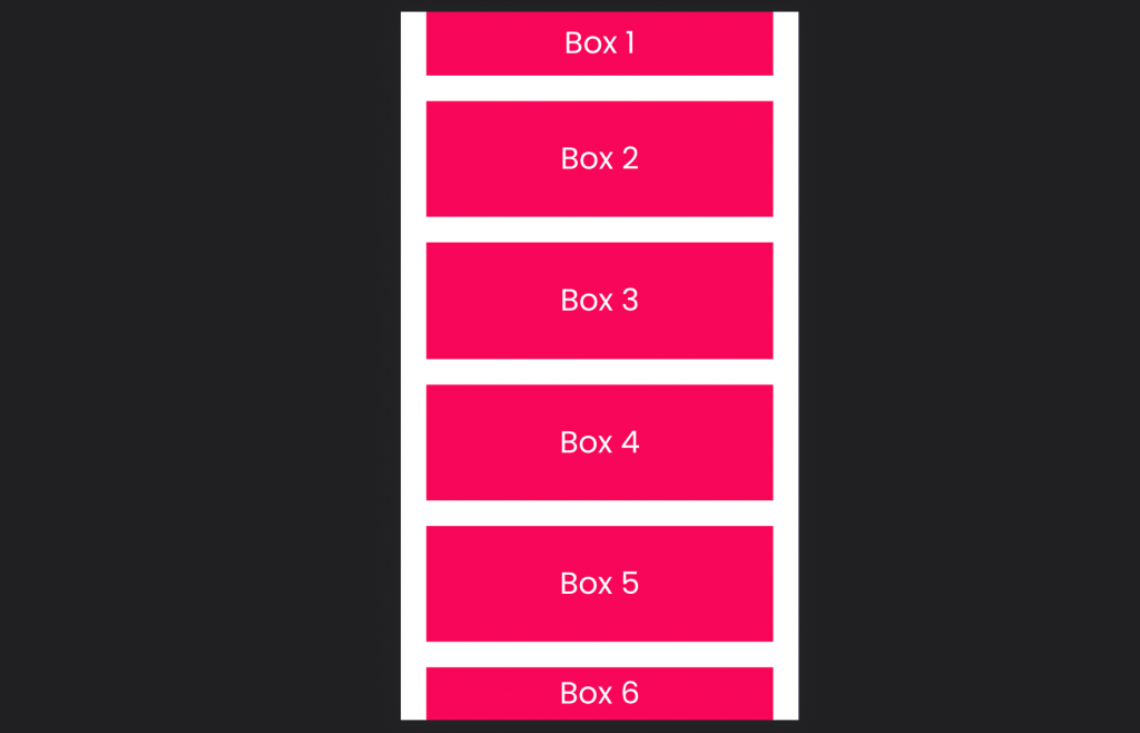
Great! Now we move on to the tablet layout and this is how it looks:
Even though the layout changed, we can still use flex, making a few small adjustments to our CSS code and adding flex: no-wrap.
Here is our CSS code updated:
					.container {
    display: flex;
    flex-direction: row; /* we change the direction */
    gap: 1.5rem;
		flex-wrap: wrap; /* we add the wrap property */
}

.one {
    width: 100%;
    height: 75px;
}

.two {
    width: 100%;
    height: 273px;
}

.three, .four {
    width: calc(50% - 0.75rem); /* we substract half column gap to each one */
    height: 200px
}

.five {
    width: 100%;
    height: 200px;
}

.six {
    width: 100%;
    height: 150px;
}
Everything seems to be flowing correctly. But unfortunately (or not), our life as developers is not that simple.
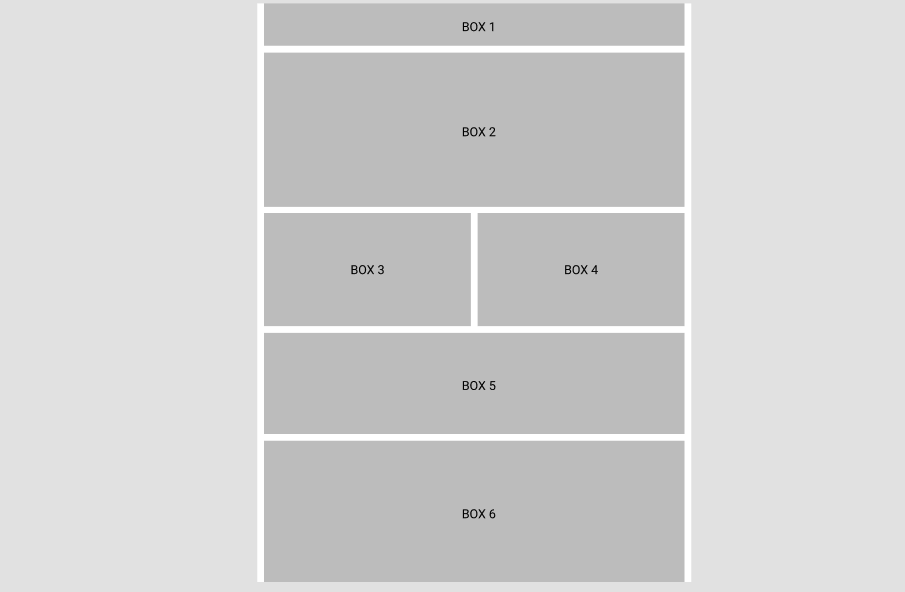
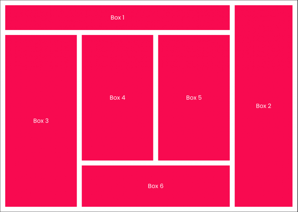
This is our desktop design:
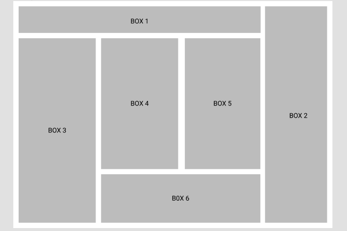
The way elements are displayed within the layout is not fluid, which means that not all elements are ‘flowing’ in the same direction (as we already saw, the flow direction within a container is determined by the flex-direction property). Instead, each element is located in a specific place and occupies a specific number of rows and columns.
It is important to clarify that we could build this layout with Flexbox, but it requires a lot of modification to our HTML code. Even if there were some modification to our design in the future, it would greatly impact the current state of our code.
This is when CSS Grid comes into play, since the focus of this design is the location of the elements in our layout.
Let’s re-write the previous case using CSS Grid
The HTML code will remain the same for all three screen sizes. Let’s see how the CSS code would look for each case:
Mobile version:
					.container {
    display: grid;
    grid-template-columns: 1fr;
		grid-template-rows: 60px repeat(4, 1fr) 50px;
    gap: 1.5rem;
}
That’s it! Much cleaner, isn’t it? The height of each column is defined by the grid-template-row property. We have obtained the same result as using Flexbox, but with much less code.
Let’s see now how it would be for tablet:
					.container {
	  display: grid;
    grid-template-columns: repeat(2, 1fr); /* we add one more column */
	  grid-template-rows: 75px 273px repeat(2, 1fr) 250px; /* row resizing */
    gap: 1.5rem;
}

.one, .two, .five, .six {
    grid-column: 1 / 3;
}
Voilà! Again, code looks cleaner. As we already know, each element will take a cell from the grid. The only thing we need to clarify is that elements one, two, five and six must take 2 columns instead of one.
Now we are in the same place as before, but with the advantage of using rows and columns. This will make it easier for us to relocate the elements in our layout.
Let’s write the CSS code together.
The first thing to determine is the number of columns and rows that our grid must have (and the sizes for each one). If we look at the layout again, we can see that it will need 4 columns and 3 rows. With this information we already know how to build our grid.
Then, we begin to place the elements one by one within the indicated cells. With the grid-column and grid-row properties, we stretch each element across the grid to achieve the design.
It is advisable to do it one by one and update the result, to make the fewest possible adjustments. Remember that the elements within a grid are automatically adjusted to the first available cell.
This is what our finished CSS code will look like:
					.container {
		display: grid;
    grid-template-columns: repeat(3, 1fr) 280px;
		grid-template-rows: 120px 1fr 200px;
    gap: 1.5rem;
}

.one {
    grid-column: 1 / 4;
}

.two {
    grid-column: 4 / 5;
    grid-row: 1 / -1; /* -1 stretches the item to the end of the row */
}

.three {
    grid-row: 2 / -1;
}

.six {
    grid-column: 2 / 4;
}
The result is as expected:
If the grid were modified tomorrow, it would be enough to modify only the corresponding grid-colum and grid-row values for each element. Nothing more. Grid has allowed us to build an extensible code for each screen size, easy to edit, and without the need to modify our HTML code.
Challenge: I encourage you to layout the 3 screen sizes using only Flexbox (changes to the HTML will be necessary).
Wrapping up Grid vs. Flexbox
Flexbox and CSS Grid are both powerful tools when it comes to designing layouts. As we said before, Flexbox is one-dimensional while CSS Grid is two-dimensional. We can build almost everything with both, but deciding which one to work with facilitates our job. It is also important to know how our component evolves through the different screen sizes to anticipate the strategy to choose.
A great piece of advice: if you are using Flexbox and you start using width: calc() to calculate the width of the elements inside a container, then you should think about using Grid.
So the next time you face this decision, remember to ask yourself the following question:
Will my component focus on the flow of its content? If so, pick Flexbox. Or will it be focused on the placement of its children inside it? Then, Grid is the right answer.
The answer to that question will make your code cleaner, more scalable, and easier to improve.
See related posts

Automated Testing Applied
Let’s explore how automated testing has made developers’ work more efficient and diverse.

Learn About Web Accessibility
Web accessibility is an essential pillar in developing and designing websites and applications that everyone can use.